User interface design has been around for decades. Lately a brand new profession — User Experience / UX design emerged from it. Before that we had Human-Computer Interaction and usability design.
All these methodologies are focusing on a single issue: how to deliver a message to users via interactive visual interfaces. How to delight visitors yet deliver business goals.
We all agree every website / app sells something. A product, a service, a subscription, a photo. Information.
And design is the art and craft to make that sales happen.
Focus points
Before UX there was Jakob Nielsen and usability. Since 1995 he taught us how to create effective websites, how to make people interact with your site in a way it will lead to certain, planned outcome.
While most of his advices are valid for websites he made a statement universally true for other interactive interfaces.
Visitors can focus only on five things on a single page.
- Identity — Making the visitor feeling safe, being in the right place
- Offer — What the page offers
- Values — What your site does that’s valuable from the user’s point of view, as well as how you differ from key competitors.
- Action — The highest priority tasks giving users a clear starting point for what to do next.
- Entertainment — If all above are not interesting for the user offer something fun which still connects / links back to your site.

Sticking to these five focus points makes interface design simple and highly effective. They give us a foundation of how pages should be structured and each section visually weighted to reach a certain goal.
Focus points define how a product is laid out and how drives attention.
Focus Groups
With UX we’ve got richer — finally! — with user research. Despite being seemingly complicated by the hype around and by the new tools and job descriptions springing every day, User Experience is all about answering a question:
Who does what, how does it feels and flows?
If you don’t have the resources — to run an entire UX department producing studies and prototypes — focus on just one thing: how your product feels to be able to define your message.
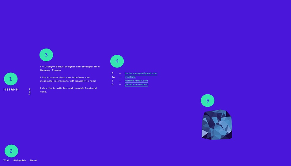
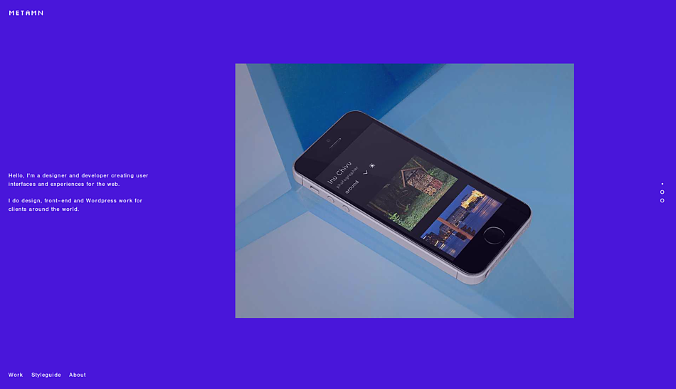
When creating my portfolio at http://metamn.io I knew my target audience will be highly educated tech people with clear understanding of web design and development trends. And my message was:
Hire me, I’m at the cutting edge of your industry.
To prove that I had to show something new, unique both in design and development.
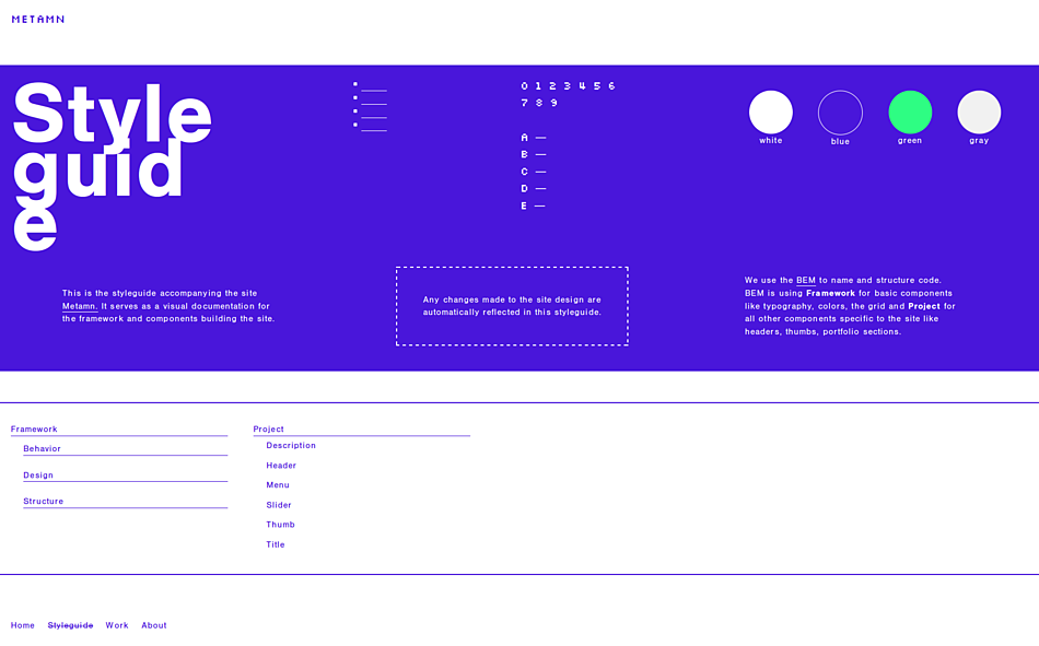
For development I’ve created a living styleguide accompanying my portfolio and outsourced it. Even today I only knew companies not single individuals doing styleguide (Google’s Material Design, Lonely Planet’s Rizzo). That should deliver the message.

On design I went with something outside the box. I’ve picked an unusual layout, an electric and vibrant color palette, a modern typeface for text and a geeky one for the logo — thanks Jason Kottke! I’ve created a simple and minimal slider and accordion from scratch to communicate my visitors I’m out of the hype, I work with homegrown, unique ingredients and yet the result is enjoyable in all environments.
The portfolio should radiate now energy, strength in simplicity, courage in pushing the web forward yet sticking to it’s basic principles. This is how I think and feel, this is my message.

TLDR;
You are always selling something. Get to know who you are selling to and come up with a message. Make that message shine through your every move, decision thus the final product.
You can check another case study — more detailed — how to deliver the message written a few years ago featuring an e-commerce project.