The first version of this article left room for inflammatory comments.
A few readers choose to continue a nonsense debate — should designers code — instead of looking at the numbers. This article is a case study not an opinionated piece.
To make it purely objective the first introductory part — Comps — and the last sections — Pain; Cure — were rewritten. The rest, the case study was untouched.
I'm in equal measure a designer — self-taught with works featured in online galleries and theme stores — and developer — with a degree in Computer Science.
This is a privileged situation some people find it funny, others unbelievable, others take it with envy.
I use it to create with confidence, end-to-end, from user research to performance. And to share the findings with others as often as possible.
Comps
Occasionally I do freelancing for clients and often times I'm hired at the development phase.
This means I'm receiving comps from designers either coming from Photoshop or Sketch, wrapped or not into Zeplin.
These comps are imperfect. They contain design decisions not grounded in web development best practices. Making a comp work sometimes is very painful and expensive.
I've been long waiting for a case study which speaks for itself. Let's see it.
The task
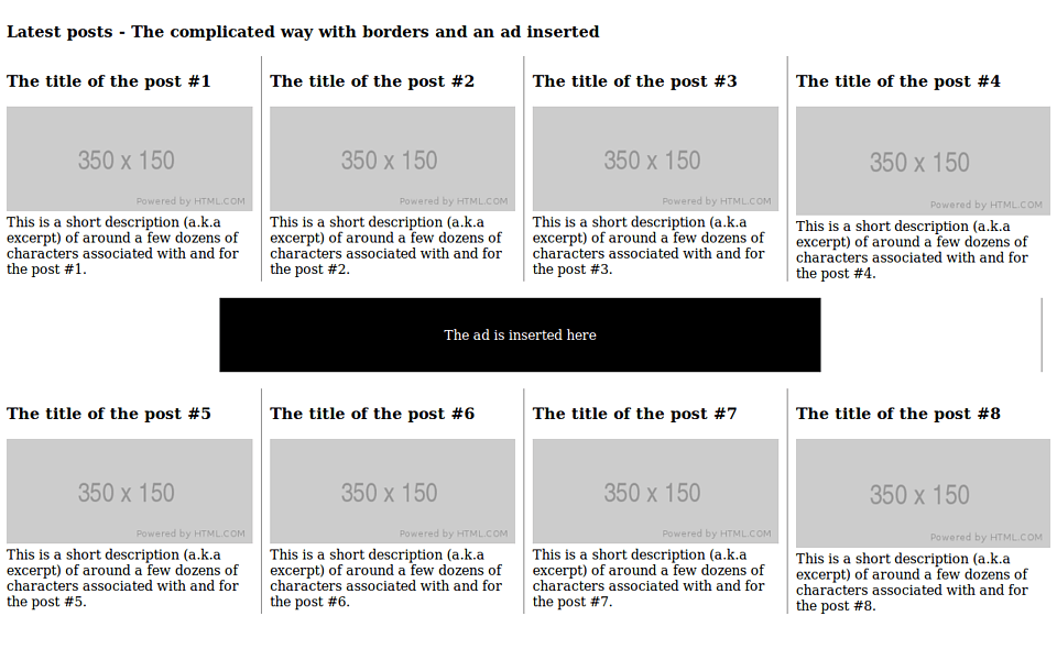
It sounds simple: list the latest posts on the homepage in a responsive way. On large screens there should be 8 posts displayed 4 in a row, on medium screens 6 posts / 3 in a row, on tablet 4 posts / 2 in a row, on mobile 2 posts each on its own row.


The comps are blurred out to protect the designer and the company. The black and red boxes are ad placeholders, and, there are gray vertical lines between columns the blurred screenshots can't show.
The comps were replicated using mockups. You can check it live on Codepen to better sense the task.
Problems
Since the designer doesn't code / doesn't consult with a developer ...
The designer doesn't know content cannot be get in a responsive way only displayed in a responsive way.
... and creates comps which makes the developer to fetch all 8 posts on the back-end and hide some of them on the front-end — such a performance waste — put to be supported by those devices which have the poorest resources.
The designer doesn't know the CSS Grid specification
... and spices up the design with vertical lines separating the columns. CSS Grid has no support for grid gap styling 2 and a nasty hack 3 has to be used to accomplish this original design idea.
The designer doesn't know exceptions are painful and bloat the source code
... and inserts an ad between the rows. The ad has different dimension and positioning which breaks the grid. An exception has to be added to support this design decision bloating the code during development time and later during maintenance.
Solutions
If the designer were coding or consulting with a developer the following design decisions were taken:
With these practical design decisions the implementation would have been easy: use the CSS Grid. Time spent would be from minutes to around half an hour.
With vertical borders the CSS Grid technique — used across the site up until now — cannot be re-used. Research has to be done to see if the specification added the grid gap styling feature recently, or if there is a polyfill, or a nice workaround.
It turned out only a workaround exists which won't fully solve the problem since the suggested bordering is ... complicated: it applies to middle columns treating columns at the edge as exceptions.
Time spent with research and workarounds: around an hour.
To implement the comp a loop has to be created over grid elements adding border only where necessary. For that I've already had a component built on Flexbox. Importing, adjusting to this current project took around half an hour. If it had to be written from scratch it would take at least an hour in plus.
Inserting the ad between the posts is way more complicated. It's about adding exceptions to an existing well working code. The back-end code displaying a post list has to be modified to insert the ad; on the front-end the grid has to be re-drawn and re-bordered.
The final front-end code is so ugly it is worth a look. 1
Time spent: around an hour.
Numbers
| Solution | Duration (min) | Notes |
|---|---|---|
| Practical implementation | 30 | Using the CSS Grid |
| Vertical borders — research | 60 | Wasted. Only a nasty hack found |
| Vertical borders — implementation | 30 | +60 mins if the Flexbox grid component were not be already written |
| Ad between rows | 60 | The result is a very ugly patch over a well written code |
| New code | Lines of code (LOC/SLOC) | Time spent (mins) |
|---|---|---|
| post-list-with-ad.php | 37 / 32 | 15 |
| flexbox-grid mixin | 62 / 54 | 60 |
| responsive-flexbox-grid mixin | 48 / 39 | 15 |
| flexbox-grid-borders mixin | 30 / 26 | 15 |
| latest-posts mixin new code | 15 / 15 | 15 |
| latest-posts--regrid-for-ad mixin | 108 / 97 | 45 |
| Total | 300 / 263 | 165 |
| Component | Operation | Exception |
|---|---|---|
| Post list with ad | Added | It might be not re-used again |
| Flexbox grid | Added | It might be not re-used again |
| Responsive flexbox grid | Added | It might be not re-used again |
| Responsive grid | Skipped | It is not re-used now while it is re-used across the entire site |
Pain
This project has a good few dozens of sections like this Latest posts depicted above. More than half of them is designed in the same unimplementable way. Or, in the same costly implementable way.
Remember: on this component alone we've spent at least 2.5-3 hours instead of half an hour. Yes,
5 times or 500% more than usual.
That's immense. It all adds up during development time, and, rolls out as a technical debt for the future.
Cure
Big / well organized / informed teams might be lucky. They've probably enrolled a perfect designer ←→ developer communication strategy to avoid this kind of extra cost and technical debt.
Small teams can do three things: