I knew something is wrong when I read about the golden age of design is coming. I'm always aware of the consequences of something big coming. It first came from The New York Times then from everywhere. IBM is hiring thousands of designers. Corporations all adopt design thinking. Startups are founded by designers. Banks and brands are buying entire design studios. Kleiner Perkins reports and the O'Reilly Radar are just about #design.
Everything is around design yet everything is looking and working the same. Maybe we don't really understand what design is.
Frank Chimero, David Hockney, Zaha Hadid
I was reading Frank Chimero's The Web's Grain in 2015 the day it was published.
First I did not get it. It's a long article — an elegant rant on how broken the web design is, and how to fix it —, and I was in an angry mood. I've just built my first, Lonely Planet's Rizzo-like living styleguide which was lost in the noise. Nobody cared about in spite it was a feat of arms — done by a single guy instead of a team, rethinked from scratch instead of being mixed together from plugins and generators, made open source and available for other front-end developers.
Realizing styleguides are a simple hype — I saw ads on Twitter by even Deloitte offering styleguides, now all gone — was a disappointment.
This year I've read Frank's article again, checked out David Hockney's approach to create art from independent parts, and got it. It became clear the future of (web) design is about embracing the unknown, to create art on an ever changing canvas from the size of a watch to a skyscraper.
I've started immediately a new project, a blog, to better analyze and understand the technique. I was experimenting with targeting different audiences from the same content base. Assembling two views on the same subject from a single data source, Hockney style.
And then Zaha Hadid died. As always in these situations I'm trying to pay my tribute by reviewing the artist's work and life. I was fascinated by how this little lady built something incomprehensible beautiful, places so unreal that people seems to be shy banking up. And when reading Alice Rawsthorn's article about how special Hadid buildings are for every visitor:
You choose your own way of navigating the space and its content
... the heureka struck me instantly. The experience is individual not a collective scheme.
Devices as designers
Devices choose their own way of assembling the space and its content
Devices create the experience with the help of the designer. Devices choose how to put together the components forming the design. Our task is to design individual content chunks, equip them with metadata — add semantics — and then each device will assembly the page, the site according to it's unique hardware and software characteristics and best knowledge.
Sounds AI, sounds crazy but it's simple. It's all about semantics, a little history and a complete change of mind.
Semantics
First time I've heard about this notion was in high school at the first computer science class. We've been told code has two equally important main characteristics: syntax and semantics. Syntax seemed to be natural and semantics made me, in secret, happy. Immediately I've thought if code has semantics then it can be my friend. I've smiled.
Since then poor semantics got forgotten until came back again with Semantic HTML5. I saw it a few times earlier too but was so masked I couldn't recognize. Think CORBA. UML. YAML.
Semantic HTML was godsend. It took away half of the cognitive load writing code for websites. Since then I write real semantic HTML which outlines well in the HTML5 Outliner. And I'm happy.
Working on my blog and musing about how an ideally perfect website can be designed and developed today — I've found out everything rolls around semantics.
Content is converted into data and metadata to be more useful for the designer; It is equipped with microdata to be meaningful for bots; It is organized into a (BEM) folder structure to be accessible for any developer; It is componentized to gain significance and be more thoughtful. Even animations are now semantic.
We've started to add meaning to everything we do and work with because we've realized our job, designing and developing for the web is herculean. We might need help to avoid the web fall upon us.
Let's make our job easier and with that more people happy. Especially those complaining about the fact that 99% of all websites look the same. Let's play with the idea of creating websites, which like Zaha Hadid's buildings and David Hockney's paintings, are self-assembling themselves. Now we have watch, tablet, laptop, desktop, TV, projector screens but in the future we will have thousands, of no media queries can comprehend.
At some stage we will need AI in our web design and development process. I don't know when AI will be able to replace us; I think we can keep our creative advantage for a while. If not in all areas at least in telling the machine about our content and the goals we want to accomplish with. Adding semantics to content, shaping content components to our maximum extent of knowledge, and let machines assembly the whole for different people, different scenarios and usage.
History unite!
Let our content be both dead and alive in a superposition of states. Let's focus on describing and designing all those states and let the machine compose a picture to the armada of observers we can't be aware during our work.
Let's review again, and reconcile what progress and perception meant thousands year ago and means now. Let's think about how view works, viewing things works, about the process of understanding.

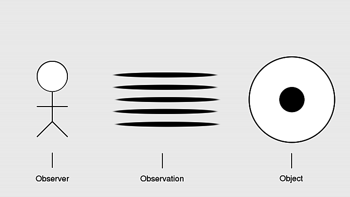
We all know there is an Observer Observing an Object. What the Observer can see depends on its Observing capabilities and the properties of the Object. In history there were two totally different approaches to enhance understanding and define progress. Thousands of years ago it was involution — the progress inwards — when the Observer reduced its Observing capabilities to zero (sight, hear, smell, touch) and become one with the Object.
Since then we have evolution where we develop our Observing capabilities — progress outwards — to an extreme extent like the Internet of Things.
You see it's all about Observing; with involution we had Hermes Trismegistus become a god; with evolution we are building our own cloud where our own gods live.
Since Design is the Observing let's see how we can involve / evolve in this special case, in our beloved universe we call web.
Supercontent
To cut in, let's equip all content with all states and let it rest in superposition, where it shows nothing, waiting for an Observer (visitor) and its Observing skillset (device) to reveal itself.
What each visitors will see from our content depends on its mental capability (curiosity) and device capability (context). We can trust their capabilities — these are none of our concerns.
With this step we let both the visitor and device (AI) to decide if they want to evolve or involve with / into our content. It's not anymore a philosophical question but of individual will. Being responsible to cut out one of these crucial observation methods in such a connected era is something nobody wants to take.
What's left for us, designers and developers, is to focus on content states and write AI algorithms to make the device so smart to be able to assembly any picture from any content and state.
What good is it?
Current design / design thinking is focused on Observing and neglects the Observer and Object.
You Observer want to get the news? The whole western press is a single pipe. No matter what you need you'll get the same. You have to put effort on finding new sources and inspirations. Read rt.com even if it is amusing but at least has a different point of view. Or get underground blog articles about how user interfaces look in China.
You Object, the creative thing? You are lost in the noise, dribbbleized. Now algorithms decide if you are worth seeing or not.
See the twist? Instead of algorithms letting you discover they force you to see the same.
Let's democratize the whole process of Observing. Let people see and use things in their own way not through the holy grail of The Lens. We designers must show everything the Object is capable and the Observer can bear not what we think is optimal. Let's step back from acting like God, instead use our powers in a liberating way.
An example
Imagine content as code. Equipped with syntax and semantics. Built bottom up from tiny individual parts which are reusable, composable. Stored in a global repository where it can be accessed and forked; searchable to the smallest details; where credits go where credit is due; and even giants are held accountable.
Is that worth it? Of course, in unimaginable ways. Code and content wants to free.
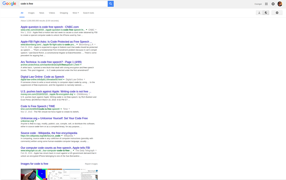
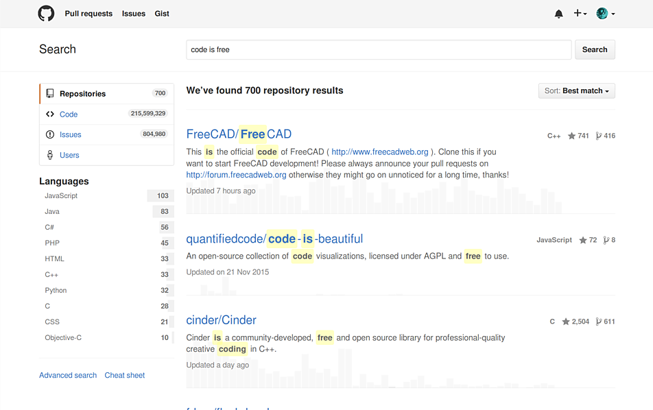
Now take a look at how a search looks like when content acts as classic as we know today, and another search where content is still not treated as code but the search engine is designed for code.
From Google we got nothing semantic just a plain list of text on the screen.
From Github we got plenty of interesting information. The 'Repositories' tab is listing who (companies, etc.) is most interested in this search phrase, 'Code' tab is listing the exact location (think article paragraph) where this content chunk can be found, 'Issues' are showing what people find unclear about it. You can see when this item was last updated, how much time was spent on creating it, how many people are reusing and liking it, who are the authors and contributors.
Now you can imagine what is like to focus on the Object.
And there is still more. We didn't talk about our favorite subject — user interface and experience design. Where is the hero? Should we add a hamburger menu somewhere? Can we use parallax scrolling on 'Issues'?
Those who got annoyed by "Devices are the designers", or asking what kind of creativity is left behind, or thinking about the disappearance of their profession: Don't worry.
Worrying about the ways of creativity, well, is stupid. Let's give creativity more source, more different audience, more space, more room to play. And the rest will follow.

