The web moves to be indistinguishable from Photoshop 1 in layout, layers and mood. Meantime is catching up with TV / video in motion and animation.
This first episode in Web Trends presents a few techniques marking this transition.
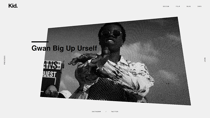
Image on hover
A very pleasant experience seen lately on Afterall Studio, Grafik and Red October is revealing images when the visitor moves the cursor over a link.
In all cases, after the page load (no interaction yet), we have a calm layout and a well delivered message. When we start cruising the site we are rewarded with:
- a surprise
- very nice graphics
- which strengthens the message
Horizontal scrolling
Horizontal scrolling is bad UX 2. Right, in cases when the horizontal scrollbar is visible. But these two examples are so smoothly executed they transform bad UX into something highly enjoyable.
Today web scrolling is rethinked and even hijacked by designers and developers. Be prepared for unconventionally scrolling websites coming next years.
Custom spacers / decorators
I was interested long time ago how to fill white space with decorations other than color and image. Something typographic which suits well the text around.
Athfield Architects found a stunning solution when creating their portfolio website. Alaa Mendili goes forward by adding animation to it.
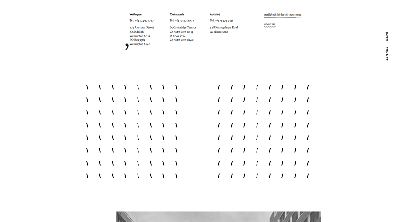
Modern typography 3 plays well with these decorators. Now it's time for the web to catch up.
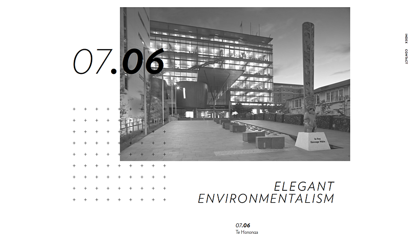
Tiny background animations
First I saw them on the Lab 21 website and I was fascinated how well they connect different sections of a page. These small moving parts in the background makes you scroll more and reach the end of the page. Perfect to deliver long messages.
Websites tend to be boring on small screens: an endless vertical flow of images and paragraphs; consecutive, similar sections made different only by their background color. No special design for mobile sites just a poor adaptation of their desktop version.
With these little connectors the uniformity of that experience can be broken and spiced up.
Horizontal lines
This might be a personal favorite: using simple lines, borders to connect or separate different elements on a page. Coming from modern typography / Swiss style / Bauhaus these lines are powerful offering endless possibilities to create a layout.
Marquee
Haha. So nineties. Welcome back!
Scrolling text is an ancient way to deliver a message. In real life our eyes have fallen into the habit of following a moving point, or a moving text. Now on web we transpile this habit and guess what: the first thing you notice on a webpage is the marquee.
Executed well the marquee is a hit. All brave designers should have it in their toolbox.
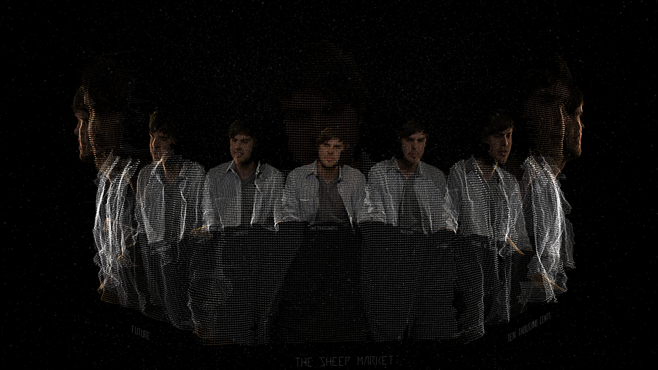
Raster images
With video came bandwidth saving. That's reducing the size of the content to the smallest, still enjoyable format. Such a technique is rastering, eliminating some pixels and even whole lines to reduce weight.
The result plays well with the rising Brutalist style 4 and is a building block of the Glitch art.
Rolling chars
It's like marquee but for characters. Every single char of a text is rotating and spinning during being displayed.
Unlike the trends above this is just a nice trick without being really useful and helpful. It won't stay long with us but it was refreshing.
Custom cursors
Like rolling chars I suppose this will be a hype instead of a trend. It goes well with Brutalism, it's so new it grabs attention immediately, it makes people click more. It does everything but I'm afraid it will be overused and finally boring.
Custom cursors were present before the web. They are reborn now. After the hype they will be refined and used carefully.
Animated Typography
It's a clear trend yet in stealth mode. Lately we've seen font foundries specialized in outlined, animated, layered type. As everything else on the screen — fonts will start moving too.
Video
Video became part of the web, a full class citizen as images are.
A year ago we've seen big, full-screen background videos now they are embedded invisibly into the page flow. It is just a start. Maybe we will have video icons maybe not. But soon every studio will have to have a motion graphics designer / producer.
Scroll hijacking
The best we can have — yet no support from browser vendors. Customizing website scrolling should be a feature of the browser not something banned.
Right now it is very difficult to make it work across devices, so kudos to all who executed well.