It's been a short and busy year1.
Meantime the web got a whole new identity flowing freely among trends, styles, paradigms — yes we can affirm — finally — the web got it's very own indistinguishable style.
This second episode in Web Trends presents techniques marking this milestone.
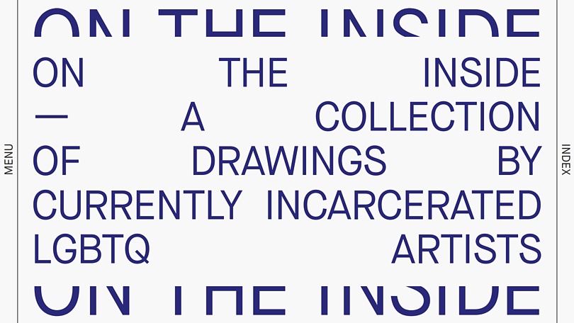
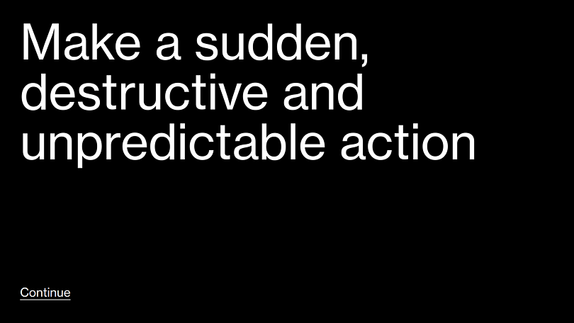
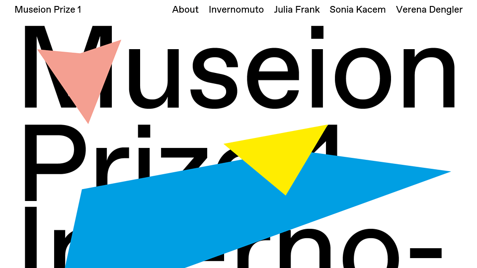
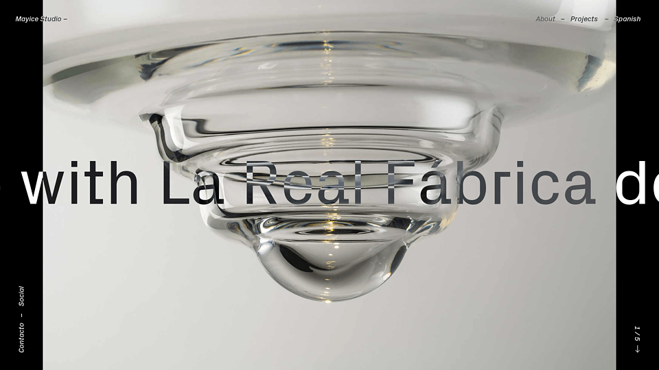
Web design is typography
We've got back to basics2.
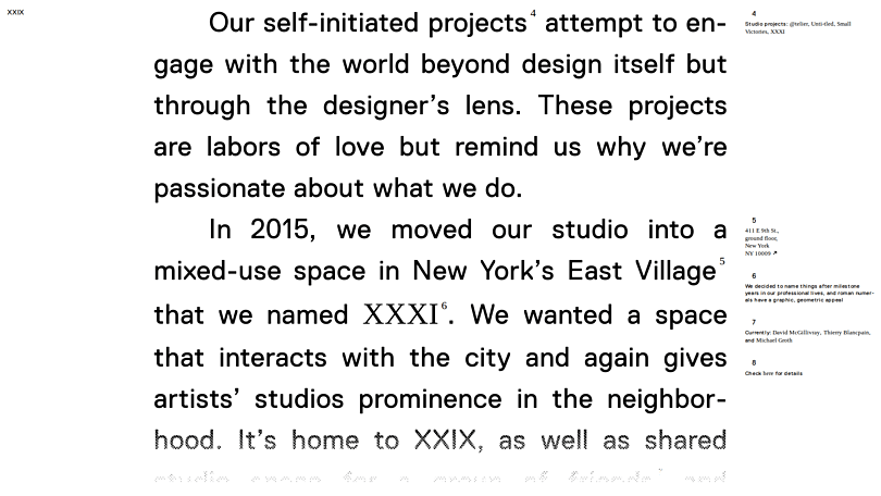
Typography is now the main design element. Delivering the message first, then doing the branding.
The new typefaces of the last few years are immersive. Set to adaptively take the whole screen; wrapped into a marquee; repeated all over again on scrolling; doing the magic on hover; equipped with smart features — text well set today tells more than thousands of images.
Interactive code art
The browser is more and more capable. It can do whatever Photoshop can do3 and soon will do whatever your TV can do.
For start it does interactive code art, well, boosting the user's experience. It's enlightening to interact with machine intelligence. You feel like a god.
New kind of gallery
The most exciting field in web design is the carousel: how to compress information in a way it does not takes space, yet on interest displays details in a much anticipated entertaining and possibly unique way.
Now we have some people who took the time and started to play with the idea. The results are unique ... and fantastic.
Bordered layout
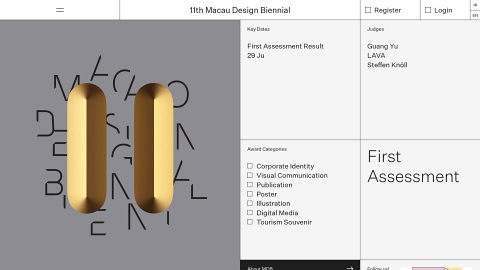
It took time from skeuomorphism through flat materialism to get to simple borders delimiting and marking chunks of information. Before brutalism4 they were a sin. Now, personally, I'm thrilled to see some perfect bordering.
Layers
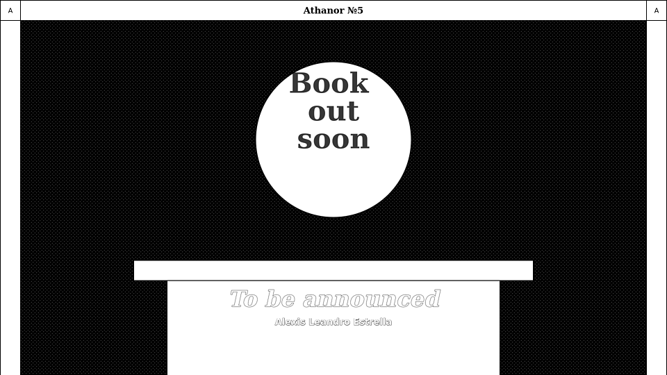
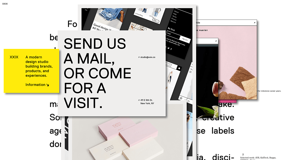
It's not a trend but maybe a returning motif; perhaps inspired by the unstoppable Windows 95 error alerts; however the 3D effect they offer for cheap; the sense of deepness the visitors associate to the site (and to it's content); and the workish interaction they require — makes layered content a weapon you can always use when in doubt.
Hand drawn decorations
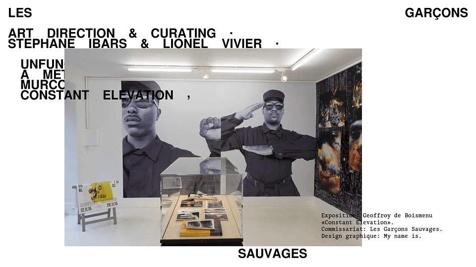
My faves; I've been always mad about adding something human, offline-y to web design. To break the monopoly of the digital aesthetics; to break computed beauty with human fallibility.
I'm afraid digital takes care to not let this happen ... until then we have this:
Live data
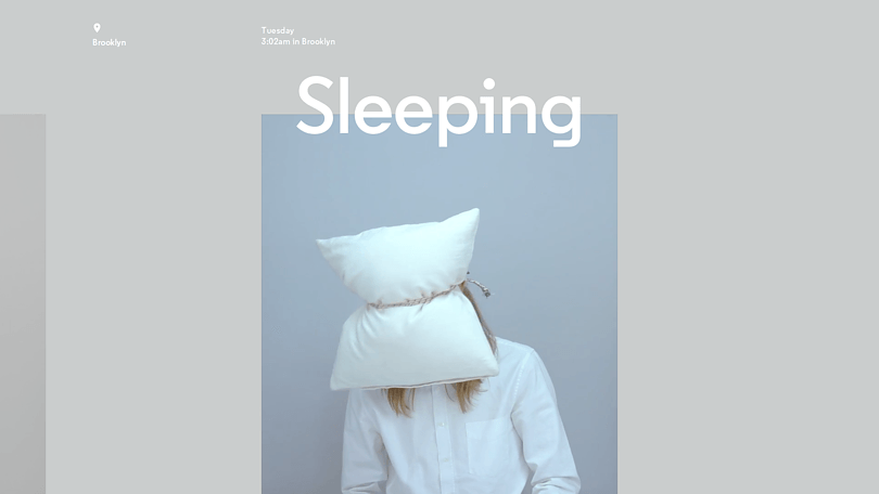
Yes, think in embedded content, which from RSS feeds and Twitter widgets went to become the main content and main design element ... now only for Wade Jeffre but tomorrow for all of us.
Changing colors
Static color schemes is our gender problem in web design; a site was born with a set of colors and dies with the same set of colors.
End that. Let the site have as many color schemes wants, in order it wants, from all around that rainbow.
Animated cursors
First there were popping up images on hover; now we have a constant visual feedback when the cursor is moved across the screen.
That can be simply stunning when executed well: not too obtrusive and keeping the mood of the site when it rests.