Every once in a while I'm spending time to see what to learn next.
If I have some needs and if I find a new trick / technology which can help I'm jumping in and start using it. But not vice versa. Even if there is a very cool technology I'm not starting to use it when I really don't need it.
This was the case with React. Since I'm not writing interaction-heavy applications I don't need it. So I've skipped React entirely.
Now I have two things on my radar: CSS Grid Layout and Material Design for the web. Both of them are cool new technologies; let's see if there is a case to use them.
CSS Grid Layout
It's kind of the successor of Flexbox which I'm already using it since the beginning.
And I'm very satisfied with Flexbox it solves all my problems. I can stretch out a page layout, an article, a list, a card, a menu — anything you name it.
I've started using it once I've read this article Solved by Flexbox back in 2013.
Now I simply can't find a similar article for CSS Grid Layout, something which clearly shows what gap this specification fills. The only useful scenario I've found to use grid vs. flexbox is to avoid page flicks in Don't use flexbox for overall page layout
This scenario is real, but almost invisible for the human eye. I've managed to overcome this flick by using placeholders for images inside a flexbox item.
However I'm sure there are use cases when grid layout is needed, like reordering a grid layout.
Material design
Google is the main source of information for me when deciding trends and technologies to use. They are probably the best on the web scene.
I've started with Polymer web components, then Web fundamentals, fell in love with Material design. My current framework is based on the same building blocks like Google's, it is inspired by their work and choice: BEM, Webpack, Gulp, SCSS and so.
A few weeks ago they've rolled out the iOS, Android and web version of material design. Wow, I really need it. For interactions especially.
I've always knew I won't create the 100,000th material-design-looking-website. Even if their technology is the best I would rather cherry-pick what I need — and can't do better on my own — instead of jumping into the bandwagon.
To my surprise their components are not 100% standalone and re-usable. They do only CSS and JS with no HTML. So you can't simply include a button component; you'll have to create the whole HTML first.
What's really useful for me here are the form controls.
So what to learn?
I have a long list of tricks and tips and hacks collected during the year marked To learn.
For me, for now the most important needs are:
And here is what I've found:
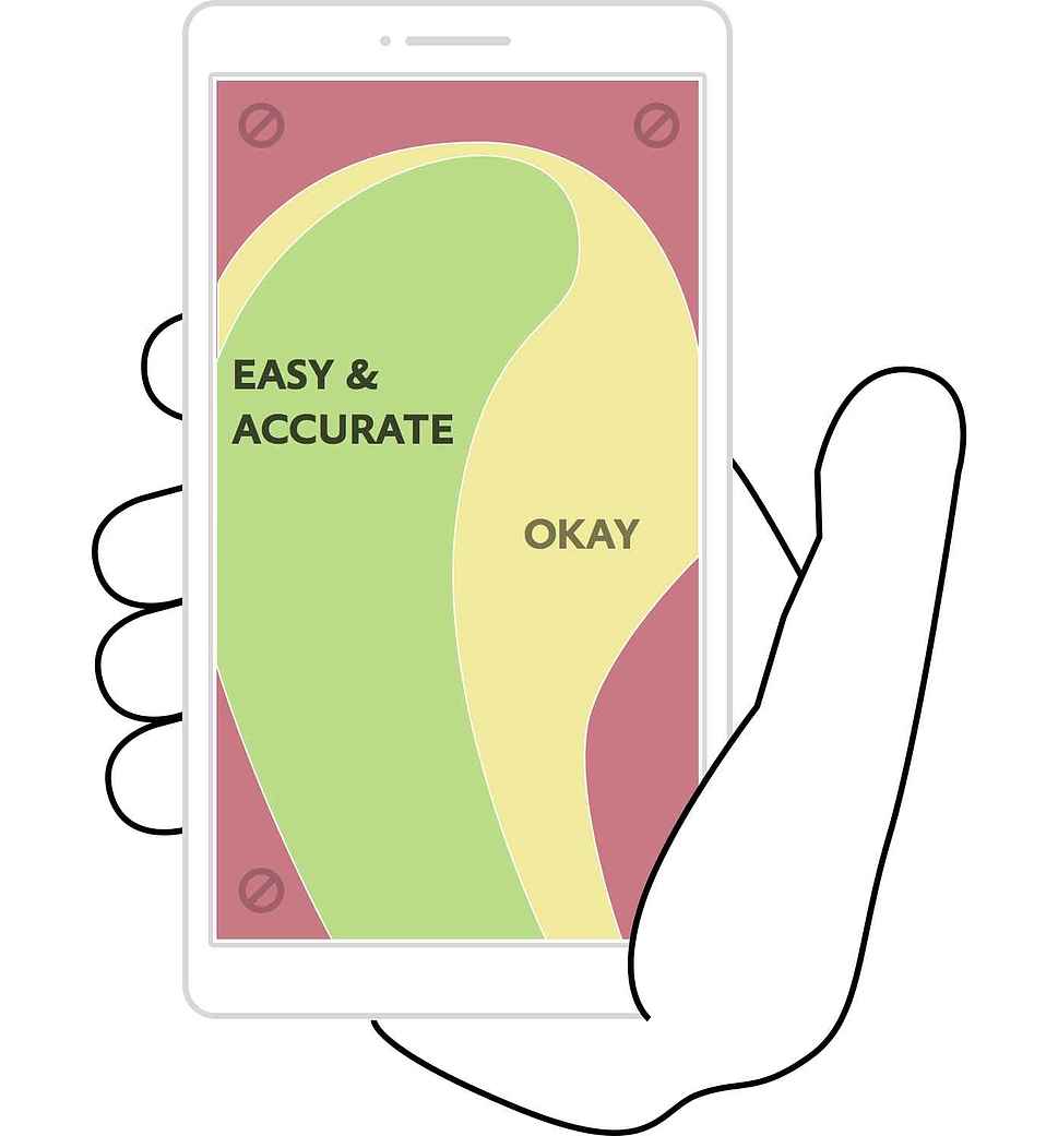
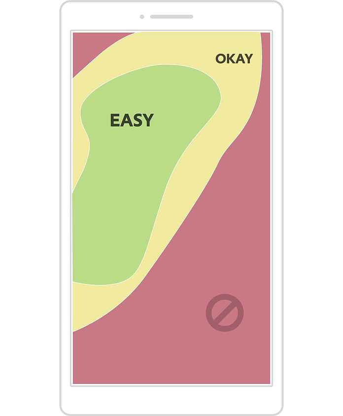
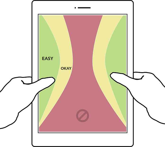
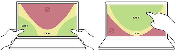
Designing for thumbs
Responsive design is not just about fitting content to various screen sizes but also about designing for thumb interactions. Mobile, phablets, tablets and now touch sensitive laptops are hold differently.
We should put interactive elements near to the user's thumb to make their effort to interact with the app / site comfortable.
Now that's the theory which cannot be put in practice since you don't know how the device is hold (left hand, right hand, both hands) and which finger(s) are used for the interaction.
This area stays gray for now.
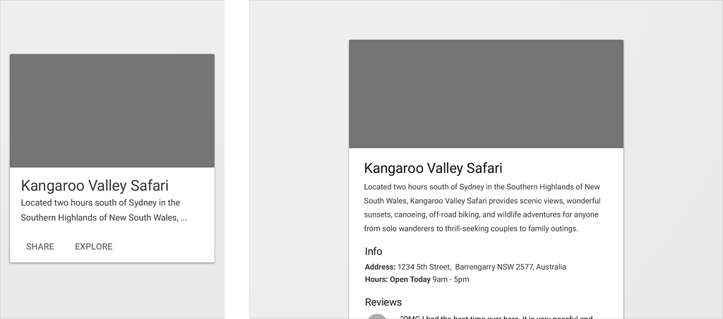
Card based user interfaces
Cards organize information into chunks of content, and users appreciate chunked content because it aids for scannability: it helps avoid walls of text, which can appear intimidating or time-consuming and allows users to dive deep into their interests quicker.
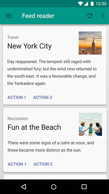
Cards divide content into meaningful sections, similar to the way text paragraphs group sentences into distinct sections. They can gather various pieces of information to form one coherent piece of content.
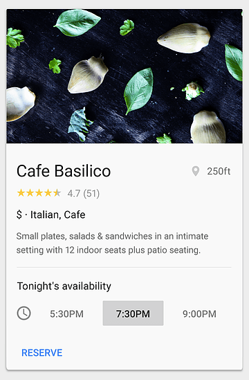
Cards are responsive. They can restructure themselves to fit any breakpoint or screen size. They can reveal the minimum necessary content on any screen size then expand it when necessary.
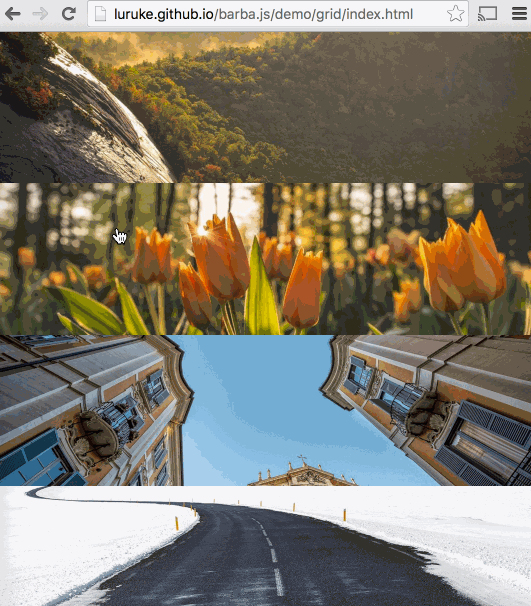
Page transitions
barba.js is a small (4.4kb minified and gzipped), flexible and dependency free library that helps you creating fluid and smooth transitions between your website's pages.
It helps reducing the delay between your pages, minimizing browser HTTP requests and enhancing your user's web experience.
barba.js uses PJAX (aka push state ajax) to enhance the user's experience.
This technique consist of preventing the normal link behavior, changing the browser url manually, and manually injecting the new content in the page. In this way there will be no browser "hard refresh".
So far so good
With card based user interfaces and page transitions at least the "Make websites look like and act like native applications" goal can be touched.
For "Find new ways to deliver unique, outside of the box experiences" I have the following list below.
The learn list
A list of lists, of small tricks and hacks worth keeping in the back of the mind. They were collected during the year.
- Decorative Text Underline
- You Don't Need JavaScript
- Gradient animations
- Text spinners
- Image Effects with CSS
- Boosting Your Rates With Psychologically Validated Principles
- How To Make WordPress Hard For Clients To Mess Up
- Advanced Search Form
- Responsive Display Text
- CSS Writing Modes
- Animated 3D Text with CSS
- Full screen popups
- Forget the hamburger menu
- Reveal images in text
- Visible grid lines
- Full screen menu
- Better interactive maps