Another year another retrospective1.
This year was lucky; the most important goals set up a year ago were achieved.
Card based user interfaces and Page transitions can be marked done.
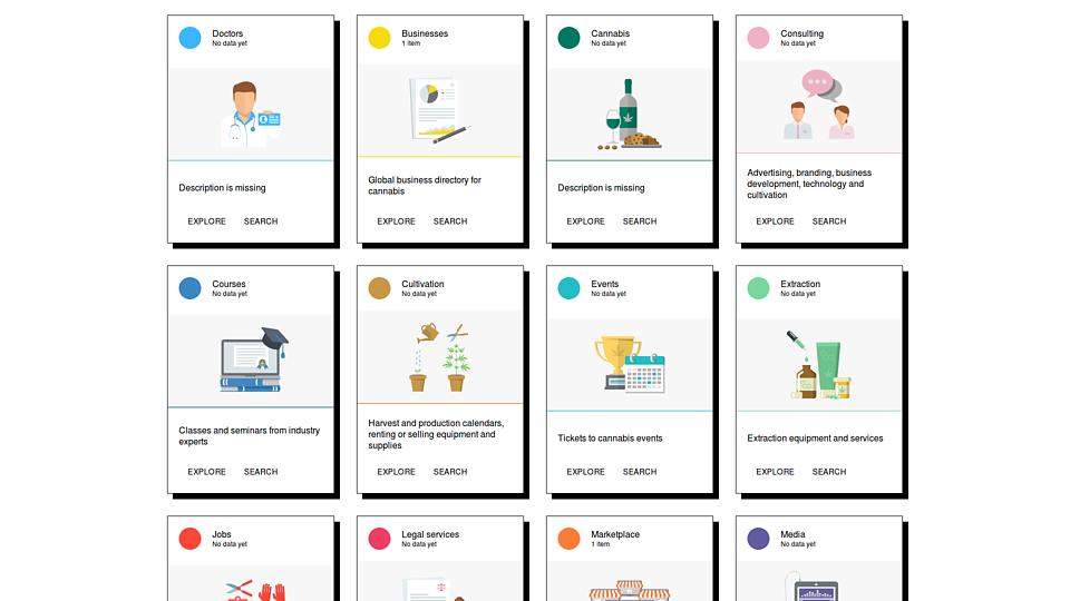
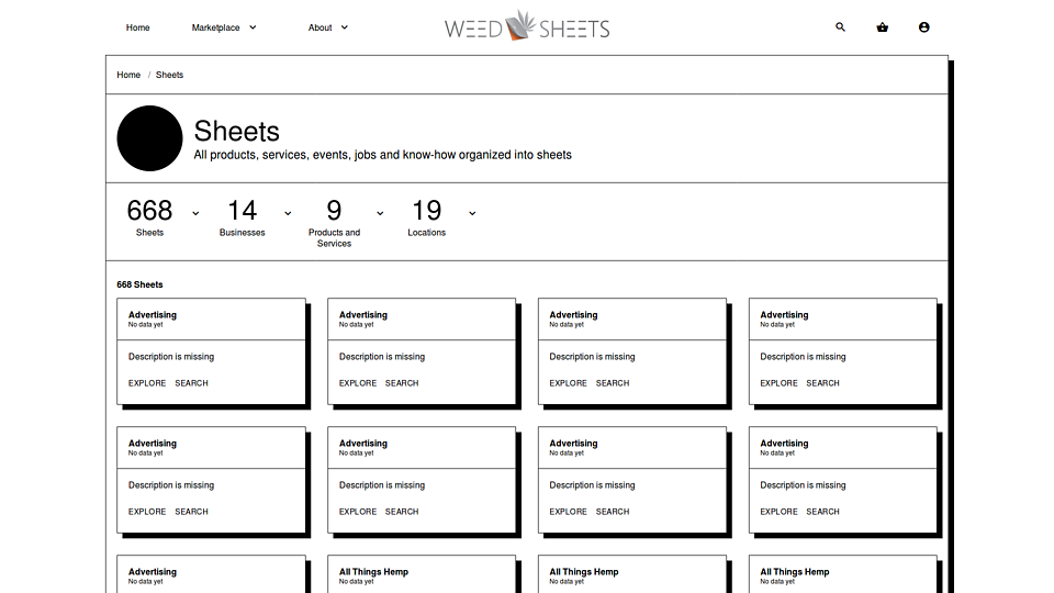
I've managed to come up with an UI for an online marketplace web app displaying tens of different product types collected into hundreds of categories using cards as seen in Google's Material Design.
The result is not Yet Another Material Design Clone but its principles applied to a specific use case.


On Page transitions I didn't went with barba.js but with Vue. While barba.js is just a trick Vue is a complete ecosystem. A story is coming about Vue soon.
So what to learn next?
It's easy. What's itching you, and what has to be learned to stay at the edge. In a lucky case both are pointing to the same direction.
In a more lucky case something is itching you and there is no solution to it. This is called business opportunity.
Responsive images
Yes they are hurting me badly. More exactly how to make a screenshot to have responsive variants for mobile, tablet, laptop — portrait and landscape modes with retina support. It's about 8 images of different sizes and markup code.
The idea is to make two screenshots of a page, one portrait and one retina, describe what sizes do you need for your responsive website, and a script generates both the images and the necessary code to display the images.
And do that in batch mode for multiple screenshots.
Debt-free code
In a recent article2 I was complaining about how herculean become the job of a generalist freelancer, ie. unicorn.
Front end development and design is changing on an unbelievable pace. While you keep up with design — SVG, CSS, JS and canvas animations; virtual and augmented reality in the browser; the brutalist movement; CSS layers; design systems; and so on — during that time the development side is running wild again: progressive web apps, reactive components, sub-second page loading time, headless CMS etc.
What one can do? Use frameworks both for the design and the development part. Like Bootstrap with Backbone; Bulma with Vue; Material Design with Angular; BEM with Gulp or Webpack.
No one can avoid anymore3 to skip frameworks.
What a real designer and developer can do is to use a framework to make code writing easier and use no framework to make UI elements look unique. Like use React but don't use Bootstrap, Bulma or Material Design with it.
Incorporate what's best in web development but keep your own visual style independent.
It's hard to do that. A year ago the BEM / SCSS / Gulp / Webpack stack was the industry best practice; now without React and Vue there is no real edge for a website.
I'm porting currently my award-winning4 BEM / SCSS / HTML / JS / JSON / MD / Styleguide driven components to Vue and I have to make hard trade-offs. Vue is in many aspects better but in some aspects not yet advanced as my old framework.
Technical debt everywhere. A risk one needs to avoid.
It seems last year1 I've pinned down better what is a debt-free framework.
I still consider it a goal well worth following.
While 1.) and 2.) can be solved by Vue or a similar ecosystem 3.) is fully personal and subjective.
Find new ways
Adbusters is this year's revelation. The printed magazine is the proudest on my coffee table; the app is the app on my iPad; the content is my lifelong hobby4; and the ad-free model is making it resilient to the current advertising / fake news scandal.
What else? It's a masterwork: perfect in all aspects.
After eliminating the code-debt I'll go after the Adbusters model: design a publication which looks the same way brilliant on all platforms be it print, web, app, or display2.
Web is to focus here. The rest was done already.
The learn list
During the year I'm collecting:
- Technical tricks and tips into my Gmail's
To learnfolder; - Technical articles
To clientsfolder and publish them regularly at Pulse - The sites I like to the
wwfolder and compile them into a Masters of Web slideshow. - The visual trends found in these websites are compiled into the Web Trends series
Now is time to compile the learn list: web techniques which put you on the edge, collected from newsletters, hacker and designer news forums, blogs and magazines.
- Declarative and stateless webgl
- Poly 3D by Google
- Programming Design Systems
- Liquid Distortion Effects
- Sliced Dual Image Layout
- Sparklines: tiny charts in text
- Kinetic Typography
- Pts.js - an experiment library
- 3D Parallax ... and more
- Computerized Forms - poster designs move to music
- Organic Shape Animations with SVG clipPath
- SVG video mask on text
- The Equilateral Triangle of a Perfect Paragraph
- Mathematics and art, in an interactive way
- CindyJS is a framework to create interactive (mathematical) content for the web.
- Chromatism - utility functions for colours
- The Experimental Layout Lab of Jen Simmons
- Little Fragments
- Human Advancement Research Community
- Creating a Book Cover Using JavaScript and p5.js
- Web developer roadmap
- Reaction - open source, real-time ecommerce
- Netlify CMS
- Color fonts
- Akiyoshi's illusion pages
- Design patterns for humans
- Google Data Studio
- Creating Generative Art with D3.js
Summary
With new frameworks like React and Vue it seems developing for the web is getting easier. You don't need to focus on organizing code (BEM) and you don't have to write Javascript to make your interface interactive (direct DOM manipulation a.k.a jQuery).
Also what's new in web and browser technology (Progressive Web Apps, Styleguides) it gets automatically incorporated into these frameworks as a result of a huge investment from corporations (Facebook, Google) and community.
What's left is to focus on visual style. Experiment in new ways of expression and collect the results into debt-free code and components.