An Approach To Web Design
This is a case study to present an effective approach to web design using industry best practices.
TLDR;
1. Design around the message
Every website sells something. A book, a blog post, a subscription, a photo. Information.
The first step is to identify what the website sells, the look and feel of the items, and how visitors will feel about them.
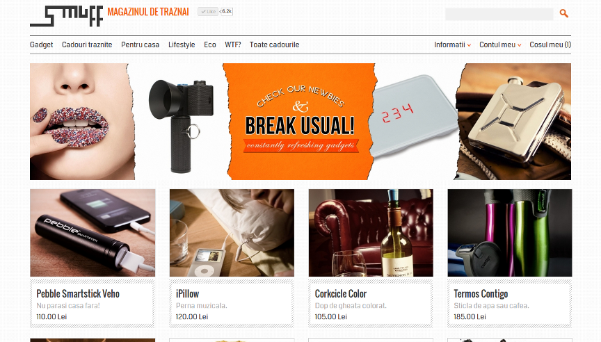
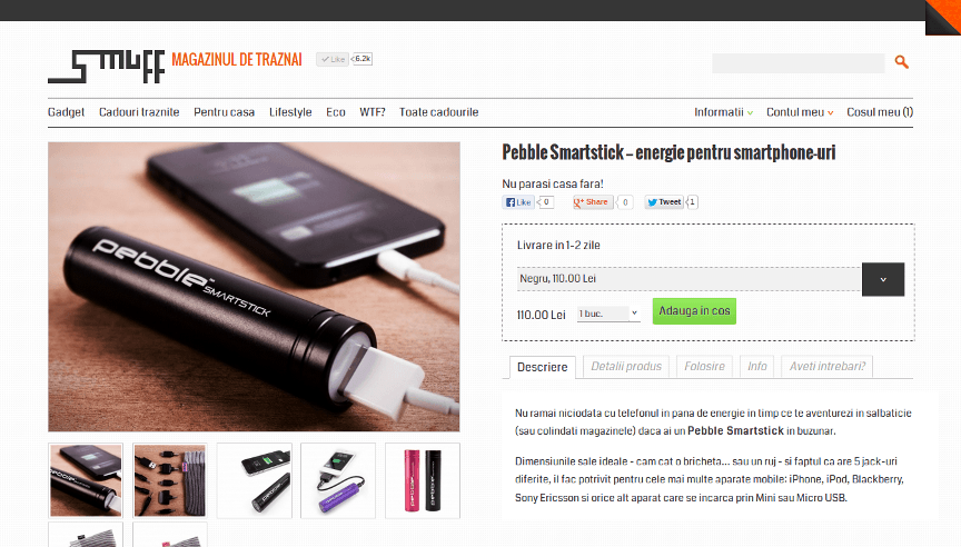
In our case Smuff sells physical products represented by photos accompanied by both short and long descriptions and price. First and foremost we are in the business of selling photos.
Smuff products are high-tech, bleeding edge, unique, never seen before toys and useful gifts. Which make visitors feel special, lucky to have discovered them.
Guess what will the main design element be? Driving the entire site design? And what message will transmit?
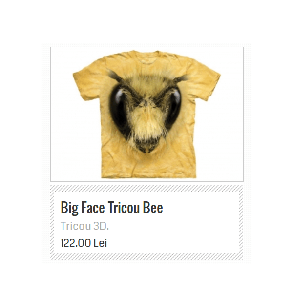
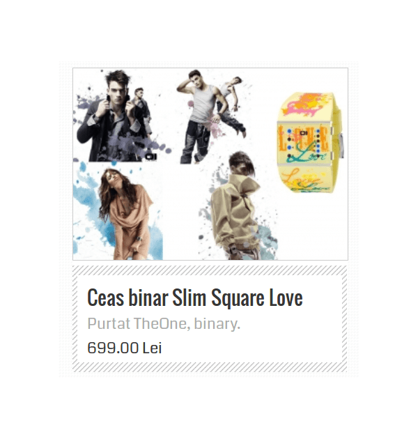
The Smuff Product Thumb
- Does it look interesting? Unique?
- Does it make you happy?
- Is it techy / geeky / cool?
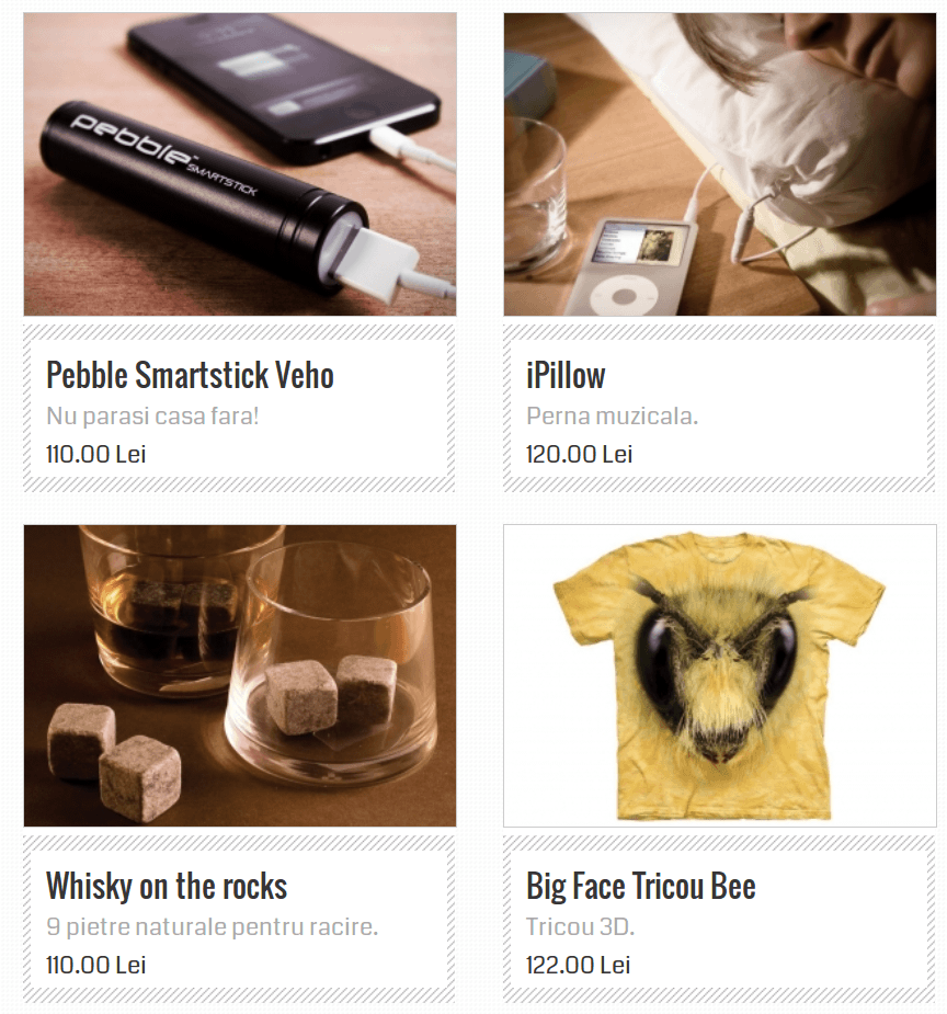
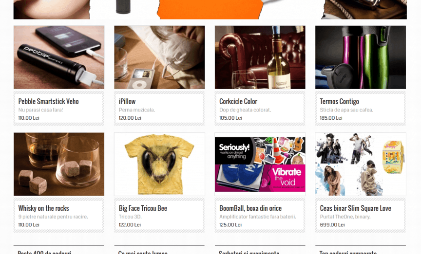
The most important design elements of the page should engage the visitor to feel happy, cool, and powerful.
Notes
- After the product thumbnail the main menu was created, then the logo.
- This made clear to us the design elements we will re-use will be — borders — from menu and — backgrounds — from product thumbnail.
- Also, the striped background won't ever be reused. Being so strong it will only serve as the main design element to compliment the product thumbnail.
2. Fit to screen
One major problem on desktop monitors is scrolling. More precisely sometimes you have to scroll to see the page as an ensemble.
Design should fit the screen. Long pages should be divided visually into smaller sections. On scrolling each new section should fit the screen.
Every section looks like a standalone page. Visitors can easily overview and understand the message. Then move to the next slide.
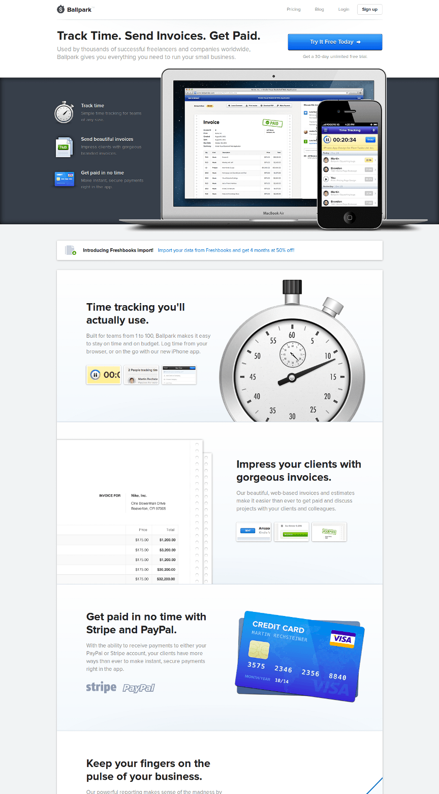
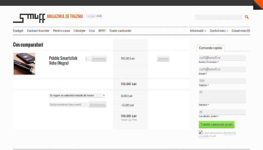
At Smuff we've done the same approach. Even the checkout page was fit into a single desktop window.
3. Focus points
Jakob Nielsen, one of the most important usability experts
narrows down perfectly in Design Guidelines for Homepage Usability:
Visitors can focus only on 5 things on a single page.
| Focus point | Function | |
|---|---|---|
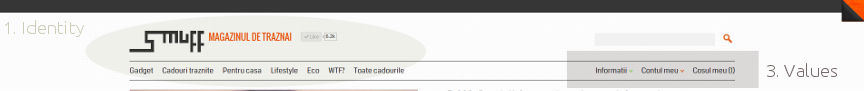
| 1 | Identity | Makes the visitor feeling safe, being in the right place |
| 2 | Offer | What this page offers |
| 3 | Values | Emphasize what your site does that's valuable from the user's point of view, as well as how you differ from key competitors. |
| 4 | Action | Emphasize the highest priority tasks so that users have a clear starting point for what to do next. |
| 5 | Entertainment | If all above are not interesting for the user make it feel good by offering something fun which still connects / links back to your site. |
Implementing these usability rules is hard at first. You should compact visually all focus points. Many times their parts are scattered around the screen.
At Smuff we've fully implemented these principles on the most important page — the product page — which takes around 70% of total traffic.
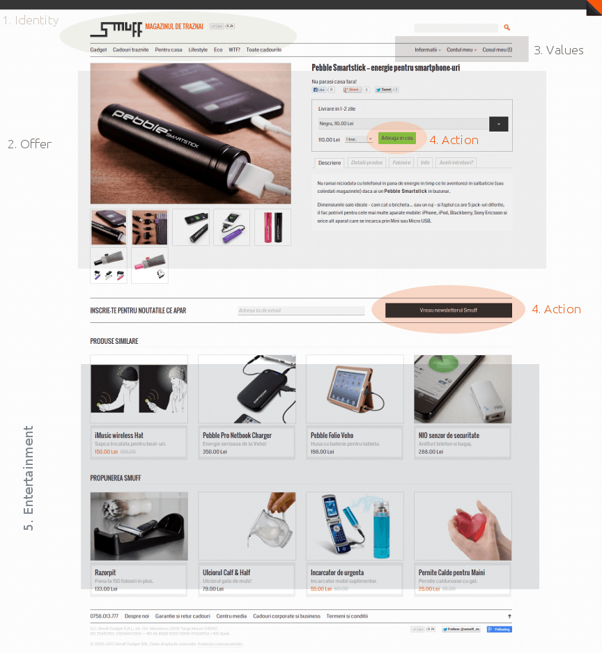
What overlaps here and couldn't be further separated are the Identity and Values sections.
Identity contains the logo, the strapline, and the Facebook like counter.
And also the main product categories which differentiate Smuff from competition.
By design categories are in the same structure like Values. They overlap in a way making the message more powerful.
4. Reuse
What makes design strong and perfect is uniformity: a few design elements used and reused all over again.
Fonts, headings, links, colors, navigation, lists, backgrounds, separators, forms, images — we have already ten elements all mandatory parts of a website.
You can use a couple of font families, you have to have at least three headings, you need at least a couple of colors, you have more than one navigation block, and multiple backgrounds.
From ten basic design elements you are already over twenty or thirty at least.
People can focus on five content blocks at once — this might be true also for design elements.
Good design stays out of the visitors' way.
It is almost invisible — just assuring the perfect flow for a visitor to become customer.
It must seduce. Design should make an imprint in people's mind. To get them back.
If not, your entire business model is doomed. You'll have to buy visitors to your site, and buy them back again.
At Smuff we've managed to make 44% of customers coming back. And we've got feedback about the perfect shopping experience.
The one-click checkout page was unseen before. And the design is so simple people are focusing only on product images — which was the original goal.
Notes
- Smuff is far not perfect. It has many design flaws, unfinished touches, non-uniform solutions.
- We know that, and we know also design is a never ending story, it is an iterative process.
- We've stopped — temporarily — when we've reached our goal: to be the best gift shop in Romania. Check it out yourself.
- On mature markets this design would be medium, or maybe banal. But first of all design should follow business objectives not just aesthetics.
5. Industry standards
Web design is not standardised and won't ever be. It will stay free, a playground for creatives.
Standardised is typography, color matching, and web development.
Typography
Being an ancient art typography reached certain level of standards during centuries. Today no one skips the typographic grid, font pairings and the vertical rhythm.
Grid
There are plenty grid systems ready to use. However I prefer to roll my own grid.
Why? Because is easy to create a responsive grid, has less bloat than frameworks imply, offers more control, and persists the principle of separation.
My HTML code has as less <... .class> and <... #id> as possible. I only use them when absolutely necessary.
I like to employ 37Signal's approach to code front-end by separating HTML, CSS and Javascript. This way structure and content stays fully themeable, adaptable to changes.
In plus rolling your own grid lets you play with niceties like the golden ratio.
Fonts and Copy
I use them as a major design weapon. I believe text lasts forever in contrast to images and colors which are subject of trend changes.
Copy is more important than design. The role of design elements is to navigate you to the message. The work is done by the text itself.
I'm a fan of the modern style.
- Headings don't stand out by size but by decoration.
- Everything is aligned to left.
- Non-linear text blocks are separated by white space.
- Asymmetry and rhythm drives the flow.
- Magazine-like design versus newspaper style.
Rhythm
When dealing with long text like blog posts you should ensure the reader won't get tired reading.
This is where the vertical rhythm steps in. Tommi Kaikonnen and Iain Lamb managed to teach me best how this works.
Feel free to check out their interactive tutorials: Interactive Guide to Blog Typography and Scale & Rhythm.
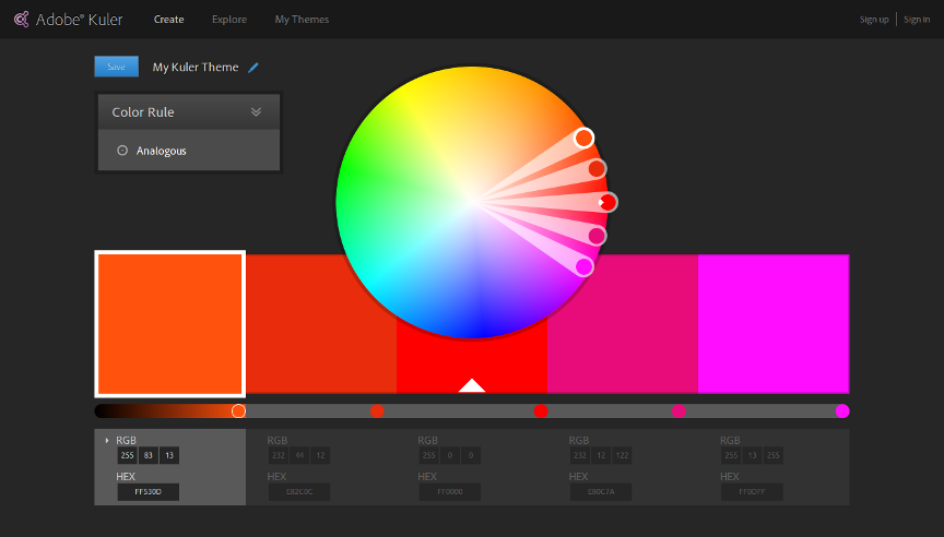
Colors
Color theory is ancient too. Harmony is a must and can be easily touched via various helpful tools.
In many cases I roll on my own color palette inspired by the world around: nature, city landscapes and objects.
In other cases I use two beautiful tools like Adobe's Kuler and Color Scheme Generator.
Web development
The code displaying your site design must be understandable by all devices, browsers and bots. This is where standards come in.
There are standard requirements for every web page. Valid HTML, mobile compatibility, analytics, semantics, usability, search engine optimisation, security, social media and more.
Also the tools and processes creating the code for web pages have been standardised.
- Content is separated from presentation and business logic — Model-View-Controller.
- Design code is not declarative but programmable — SASS and other CSS frameworks.
- Everything is measured and optimised for performance.
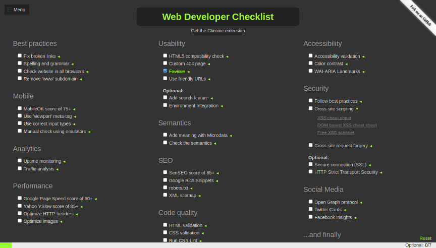
The most complete list of standards and best practices I've found on Web Developer Checklist. However I've never met a budget allowing the implementation of all these must have features.
6. Summary
- Design follows the message.
- Always fit content to the screen.
- Drive your visitors attention.
- Keep your design lean by reusing elements.
And if you want to create something that really stands out ask for a budget before starting the project.